

Infographics
Military Expenditures 2013
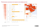
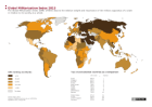
The graphic depicts the trend of global military expenditures between 1990 to 2013, as well as detailed information for the year 2013 for the top 10 countries. The absolute figures of these top 10 are compared with their value as share of gross domestic product and with health expenditures.
More ...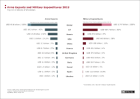
")
")
")