Infographics

image
Infographics

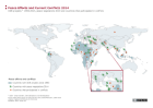
Peace Efforts and Current Conflicts 2014

This graph shows peace efforts and conflicts in 2014. All countries where, since 1990, so-called disarmament, demobilization and reintegration (DDR) efforts have taken place are shaded in blue. Countries in which peace negotiations took place in 2014 are marked with a green myrtle branch as a symbol of peace.

More ...
image
Infographics

National Deployments to UN Missions

The graph shows the size of national troops participating in UN missions (2015). It compares the ten countries that sent the most troops to UN peacekeeping operations (based on data provided for April 2015) to the ten countries with the highest gross domestic product (GDP).

More ...
image
Infographics

Times of Peace 1946 to 2016

This information graphic provides information on the number of years a country has been at peace since 1946. For states that did not exist in 1946, the year of state formation is taken as base year.

More ...
image
Infographics

German Participation in UN Missions 2000 to 2014

The graph on the German participation in United Nations peacekeeping operations is twofold. The upper graph shows two curves representing the number of police and military personnel as well as military experts for the years 2000 to 2014.

More ...

Buchhandlungen bangen um die Buchpreisbindung

Data tables

For some select map layers, the information portal ‘War and Peace’ provides the user with all used data sets as tables.

More ...
Magnifying Glass in front of a Boston map

Country portraits

In the country reports, data and information are collected by country and put into tables that are used in the modules as a basis for maps and illustrations.

More ...
Compass with Mirror

Navigation and operation

The information and data of each module are primarily made available as selectable map layers and are complemented by texts and graphs. The map layers can be found on the right hand side and are listed according to themes and sub-themes.

More ...